
Follow up: Excel Table Formatting
Sometimes, to make Excel do what you want, you have to be creative. This article reviews more details of the spreadsheet used in this screencast, including the use of a “glass” scatterplot, conditional formatting, and macros. The actual spreadsheet can be downloaded here.[1]
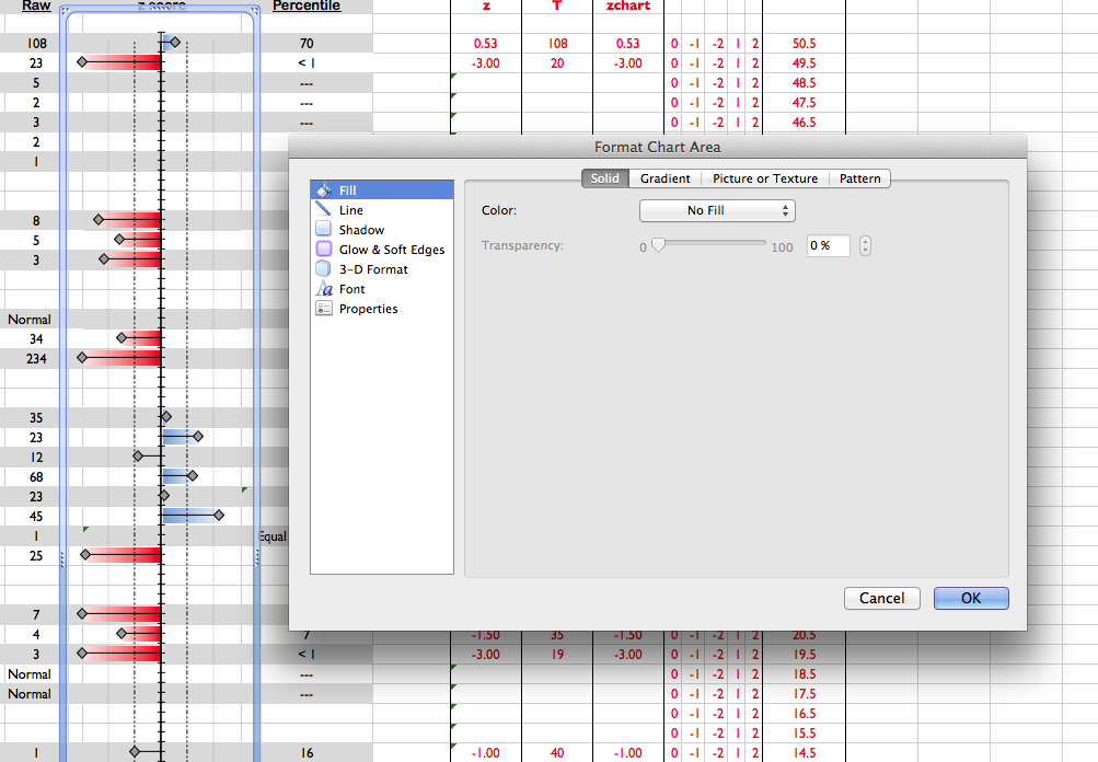
To understand what is happening in this spreadsheet, it is important to realize that there is a “glass” or see-through scatterplot placed directly over Column D in the “Results Overview” spreadsheet. The cells of Column D use conditionally formatted “data bars” so that values greater than a T-score of 50 or less than a T-score of 30 are highlighted blue and red, respectively.
Scatterplot
The Excel spreadsheet used in the previous screencast was informed partially by this article. Basically, the graph is a scatterplot in which only the values plotted against the horizontal axis (the T-scores) are meaningful (see Column G, “Results Overview” spreadsheet). The values on the vertical axis (Column N, “Results Overview” spreadsheet) are place holders that simply help align the data points to the appropriate row.
The scatterplot is made “clear” by selecting “No Fill” in the properties of both the “Plot Area” and the “Chart Area.”
Conditional Formatting
The cells of Column D use conditional formatting. If you go to cell D12 and use the menu Format > Conditional Formatting, you can begin to see how to use conditional formatting. More options are accessible from the Home tab of Excel’s tool bar ribbon. Microsoft’s Excel Blog is a good place to start learning more about conditional formatting options.
Macros
Only three macros are used in the spreadsheet. The first pastes data from the clipboard into the spreadsheet. The second macro saves a .pdf version of the data table to the desktop. The third clears the workbook for the next patient’s data.
To learn more about how to write or record macros, search the internet! You can probably find sample code to get you started. In this particular workbook, however, the macros can be accessed by going to Tools > Macros.
So, What Does This Have to Do With Neuropsychology?
Good question. Three answers:
- Communication. It is vital that a clinical neuropsychologist relay information to patients, their family, and other healthcare providers in a manner that is clear and concise. The table produced by this workbook is meant to communicate information succinctly. It is used during team meetings and in the final clinical report.
- Efficiency. Fast report turnaround time makes everybody happy.
- Billing. The faster reports are finished, the more patients can be seen in a given period of time.
Note About the Battery
This particular battery is used as a brief dementia screen. Most of the measures can be scored using the Calibrated Neuropsychological Normative System (CNNS-SP). The only components of the battery that are not part of the CNNS-SP include Go/No-Go and the 2- and 3-D drawings (i.e., a cross and a house).
-
Columns are labelled so that one can see how various parts of the spreadsheet are used for formatting purposes. ↩
Similar Pages
Learn More. Know More.
